P.P.I.E.: Weidner Albertype Variants
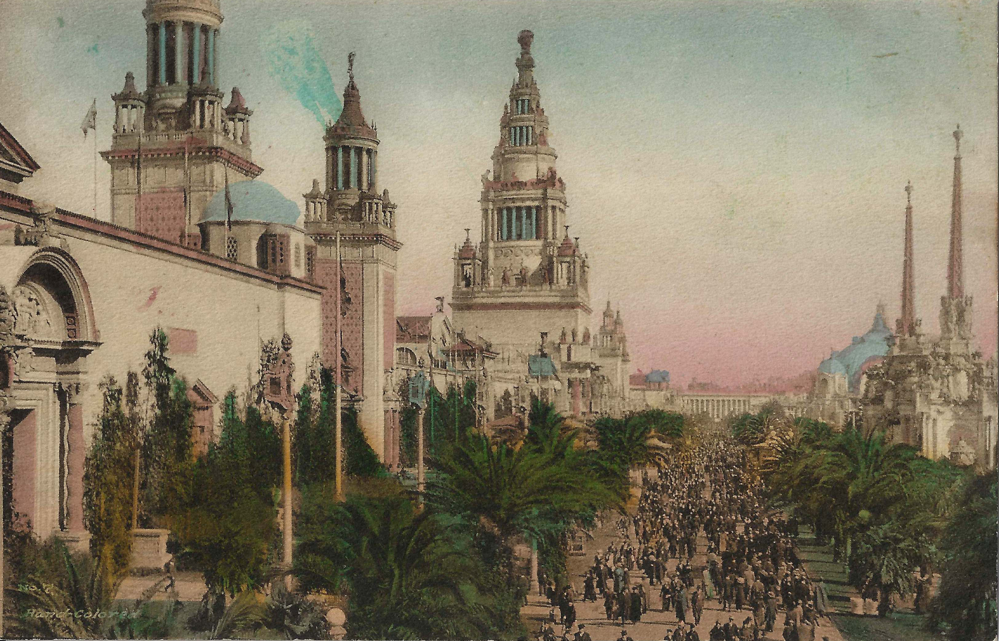
Charles Weidner published beautiful souvenir postcards of the 1915 Panama-Pacific International Exposition. The cards were printed by Albertype (Brooklyn NY) on unusually heavy stock. The front of each card contains the notation "Hand-Colored". I'm not clear about the process, but the result is stunning. There is substantial color variation between different examples of the same card, as shown below.
 |
 |
 |
 |
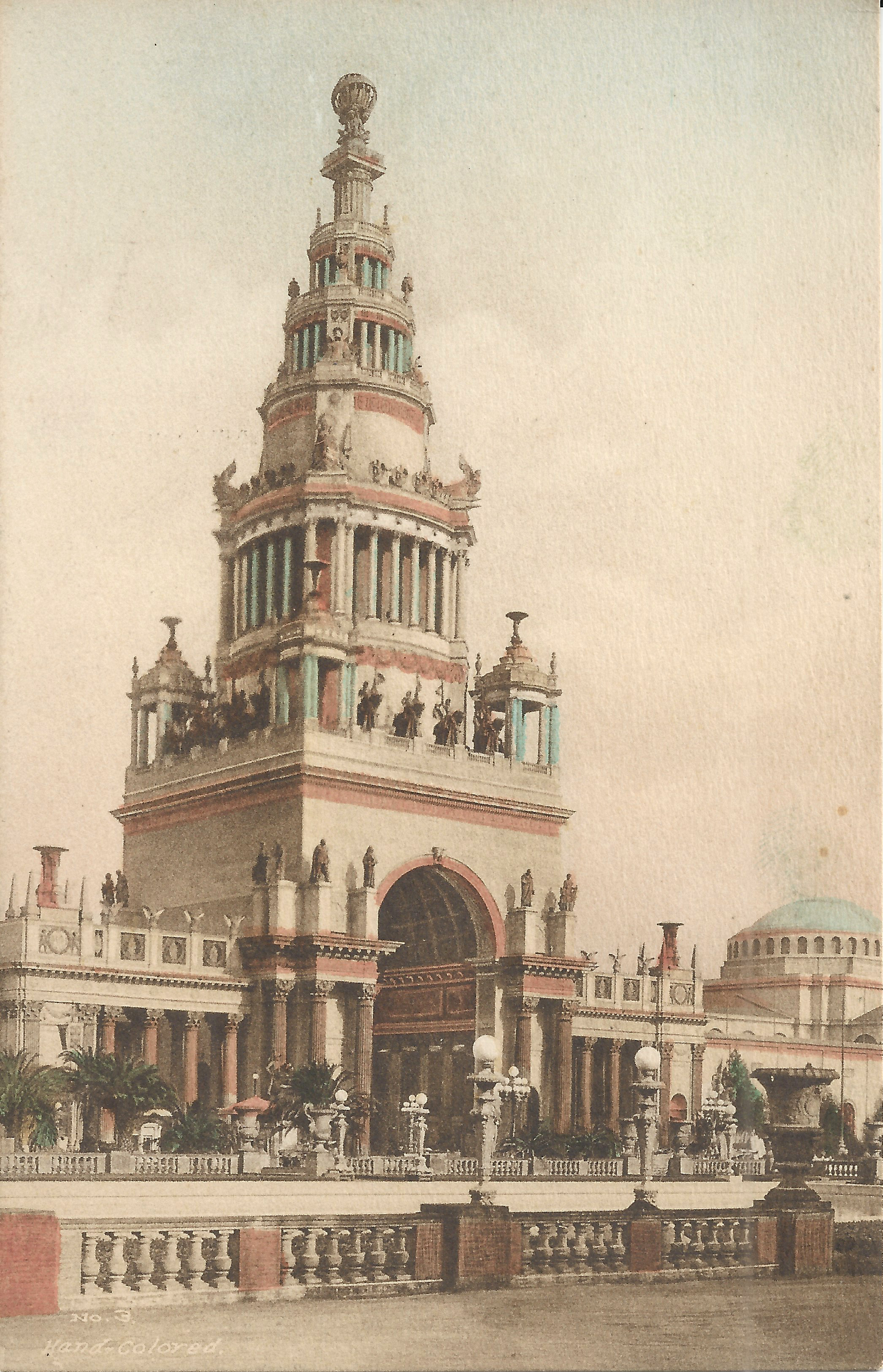
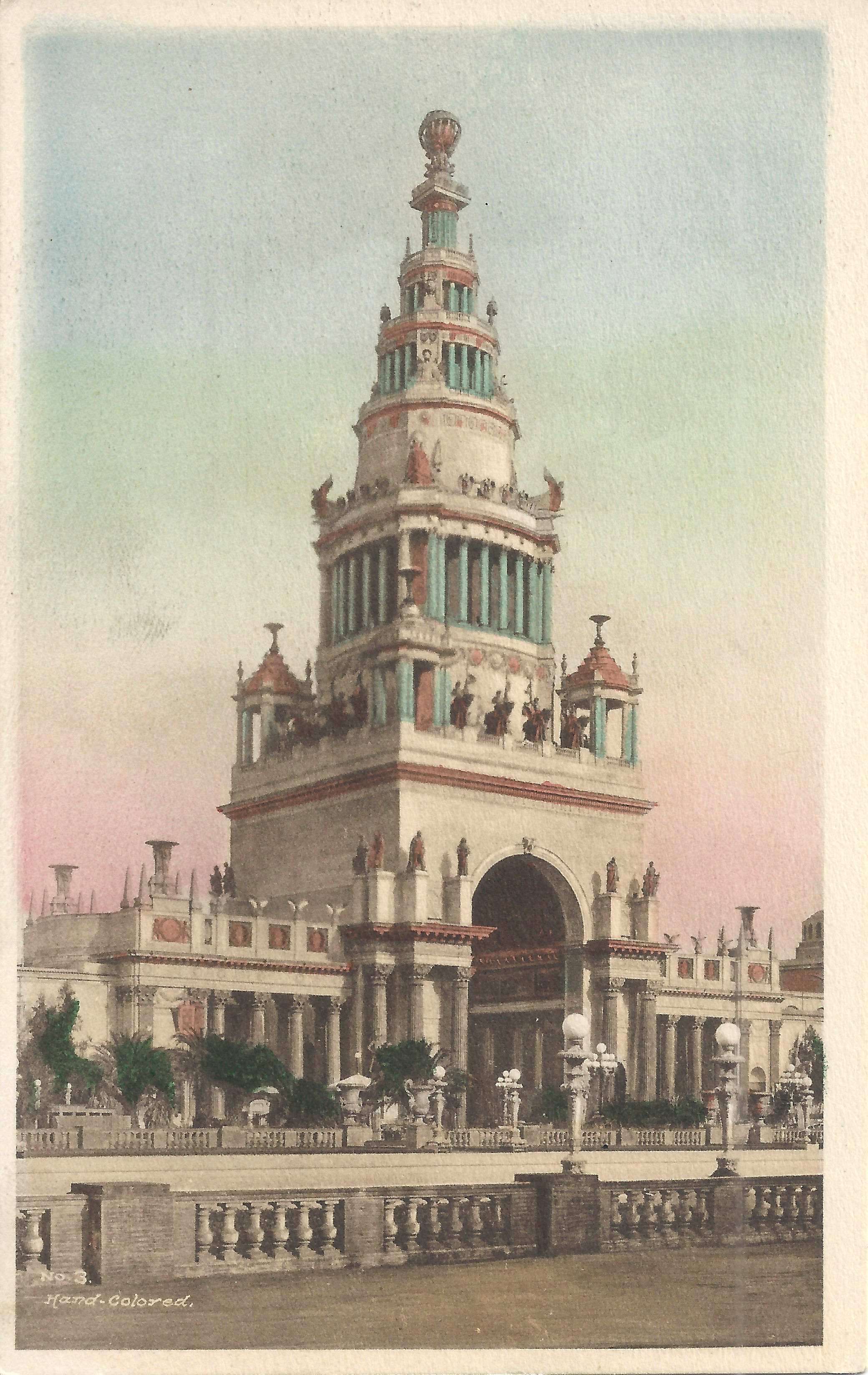
No. 3: Tower of Jewels. In addition to the difference in coloring, the image is cropped differently and the card on the right has an empty border.
 |
 |
 |
 |
 |
 |
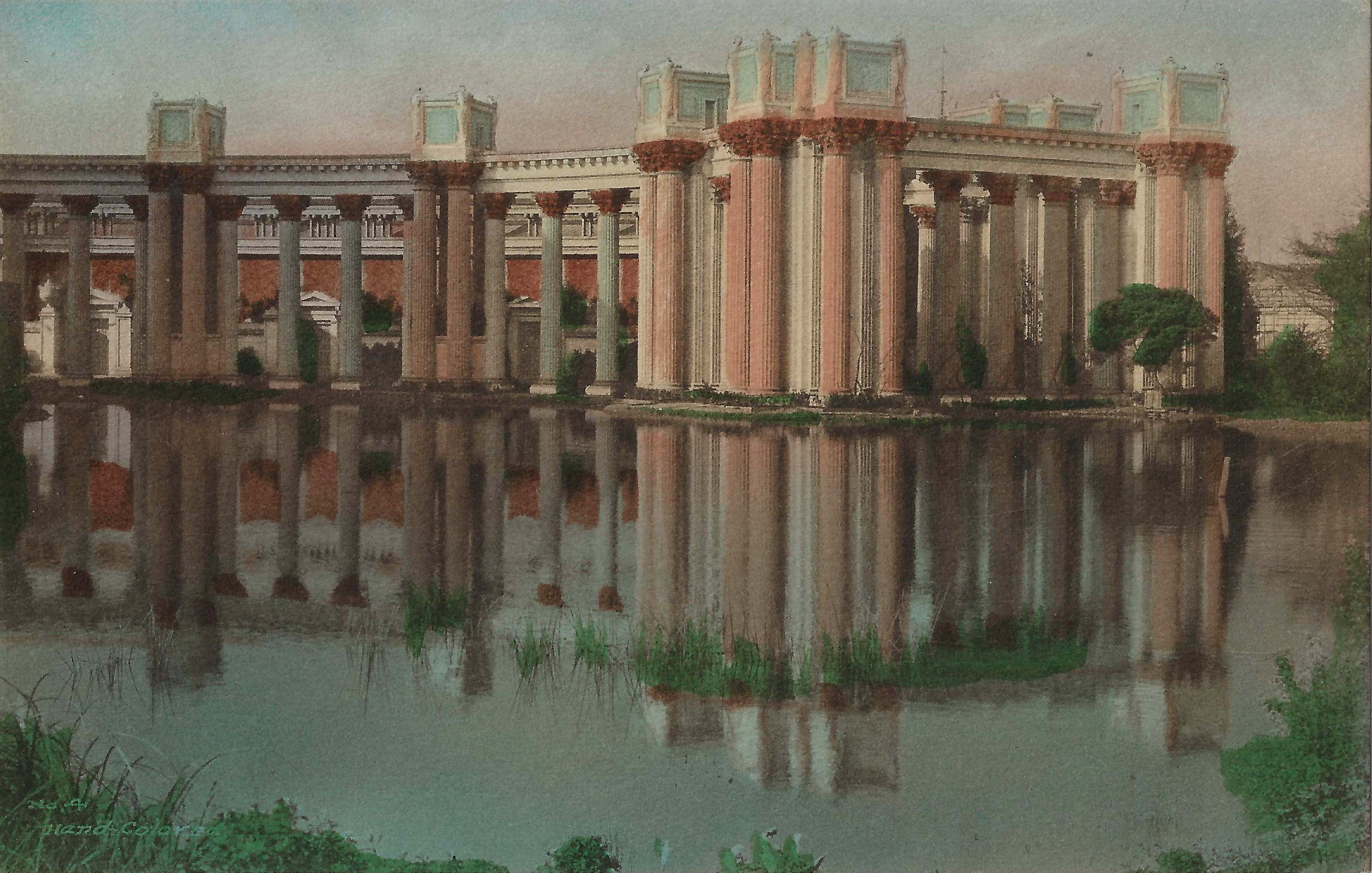
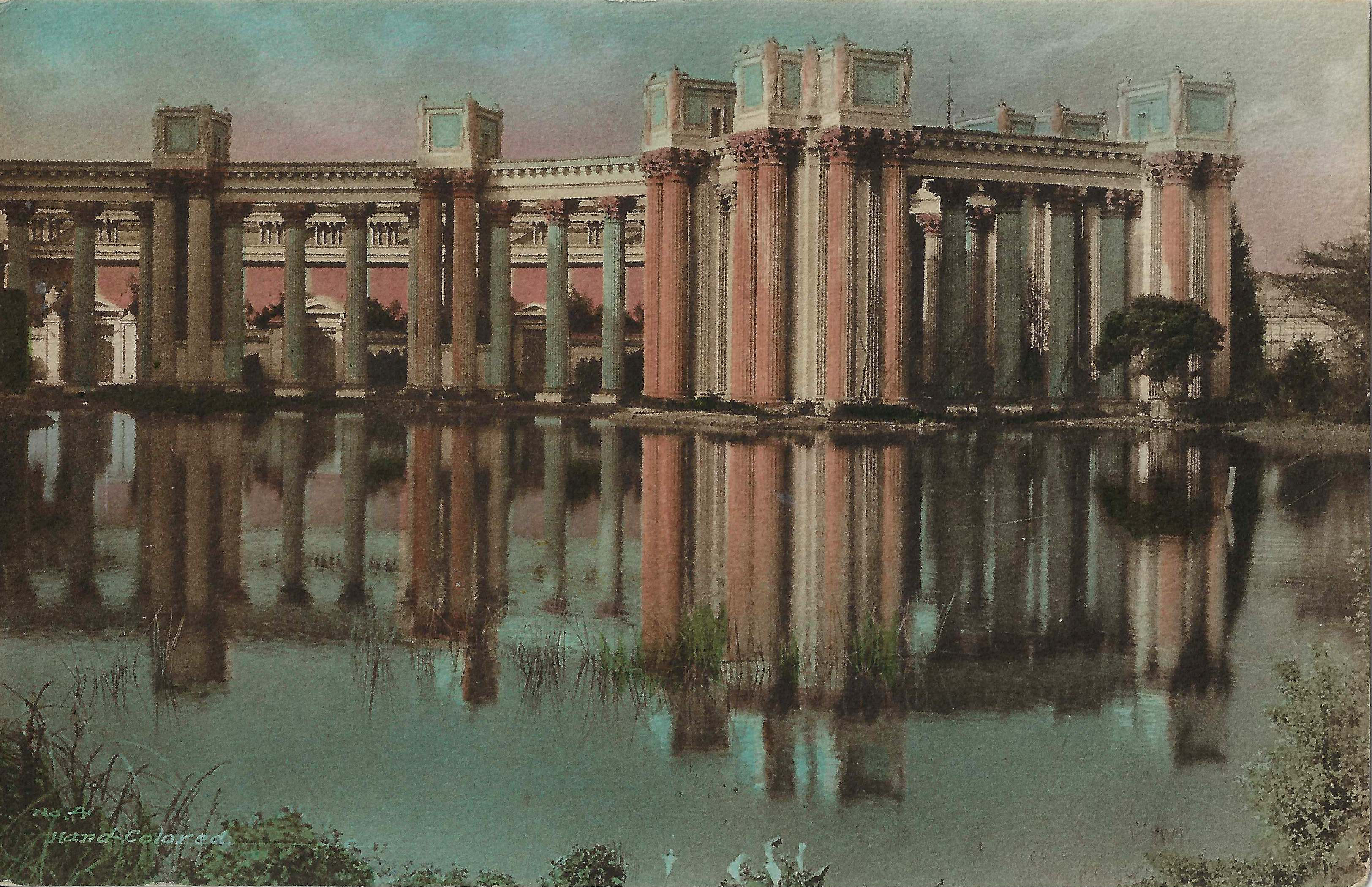
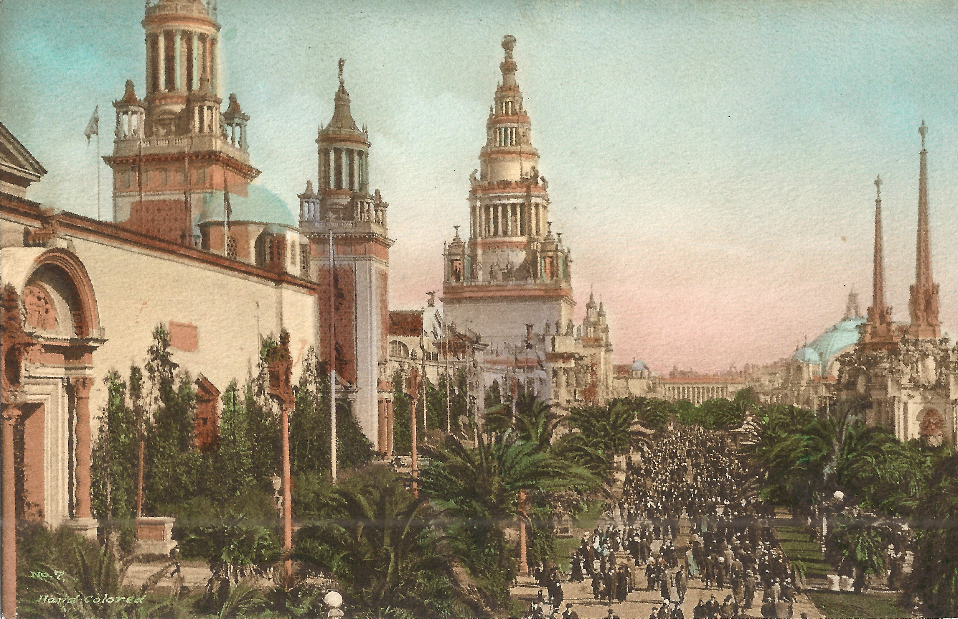
No. 4: Peristyles—Palace of Fine Arts. Each example is colored quite differently.
 |
 |
 |
 |
No. 7: Palm Avenue. The card on the right has a blue blotch next to the middle tower, presumably a coloring error. I believe the blue semicircle left of the middle tower represents a dome, but on the lefthand card the left tower is visible through it.
Steve's SF postcard pages: