P.P.I.E.: Weidner Albertype Variants
Charles Weidner published beautiful souvenir postcards of the 1915 Panama-Pacific International Exposition. The cards were printed by Albertype (Brooklyn NY) on unusually heavy stock. The front of each card contains the notation "Hand-Colored". I'm not clear about the process, but the result is stunning. There is substantial color variation between different examples of the same card, as shown below.
 |
 |
 |
 |
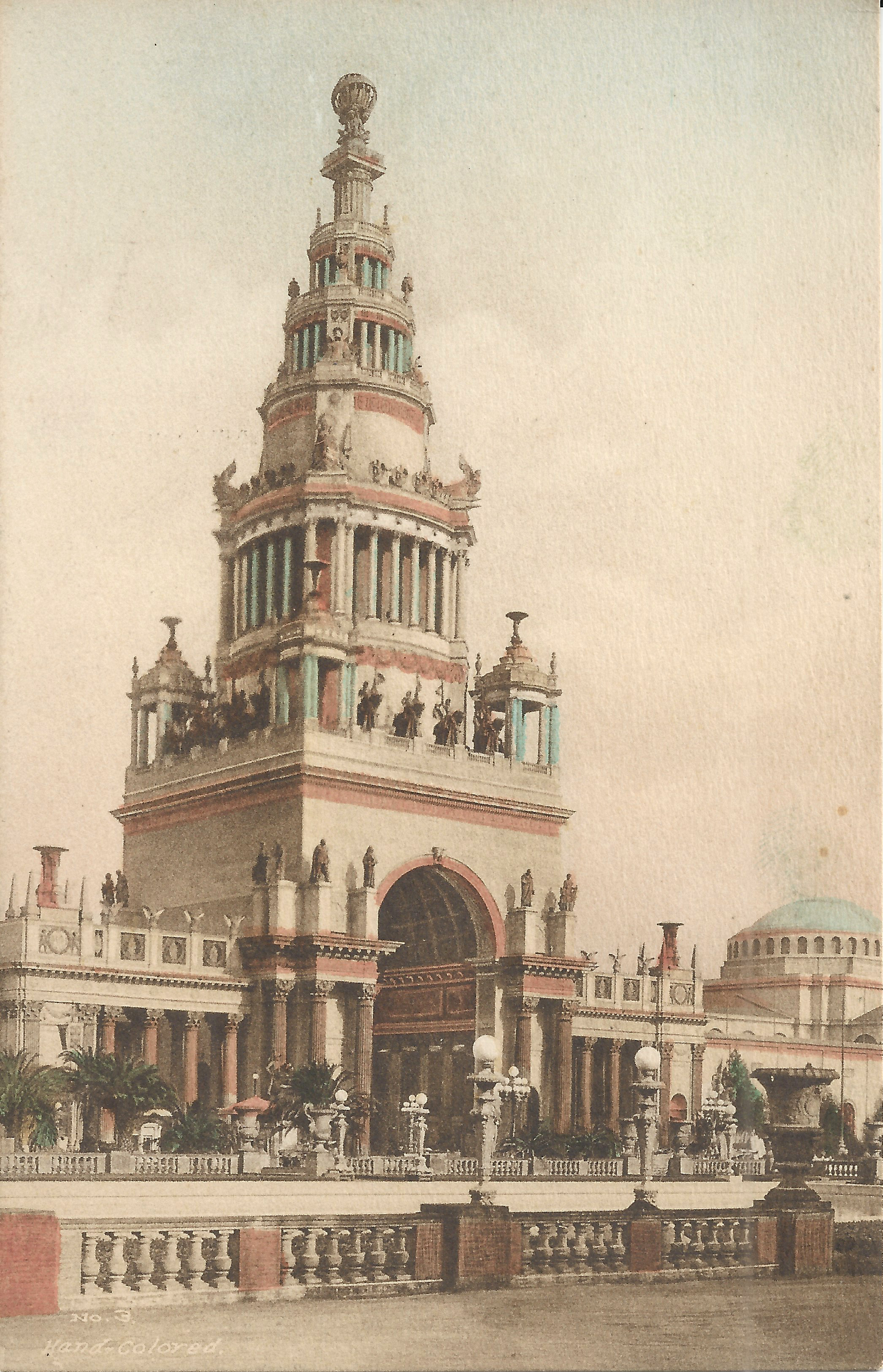
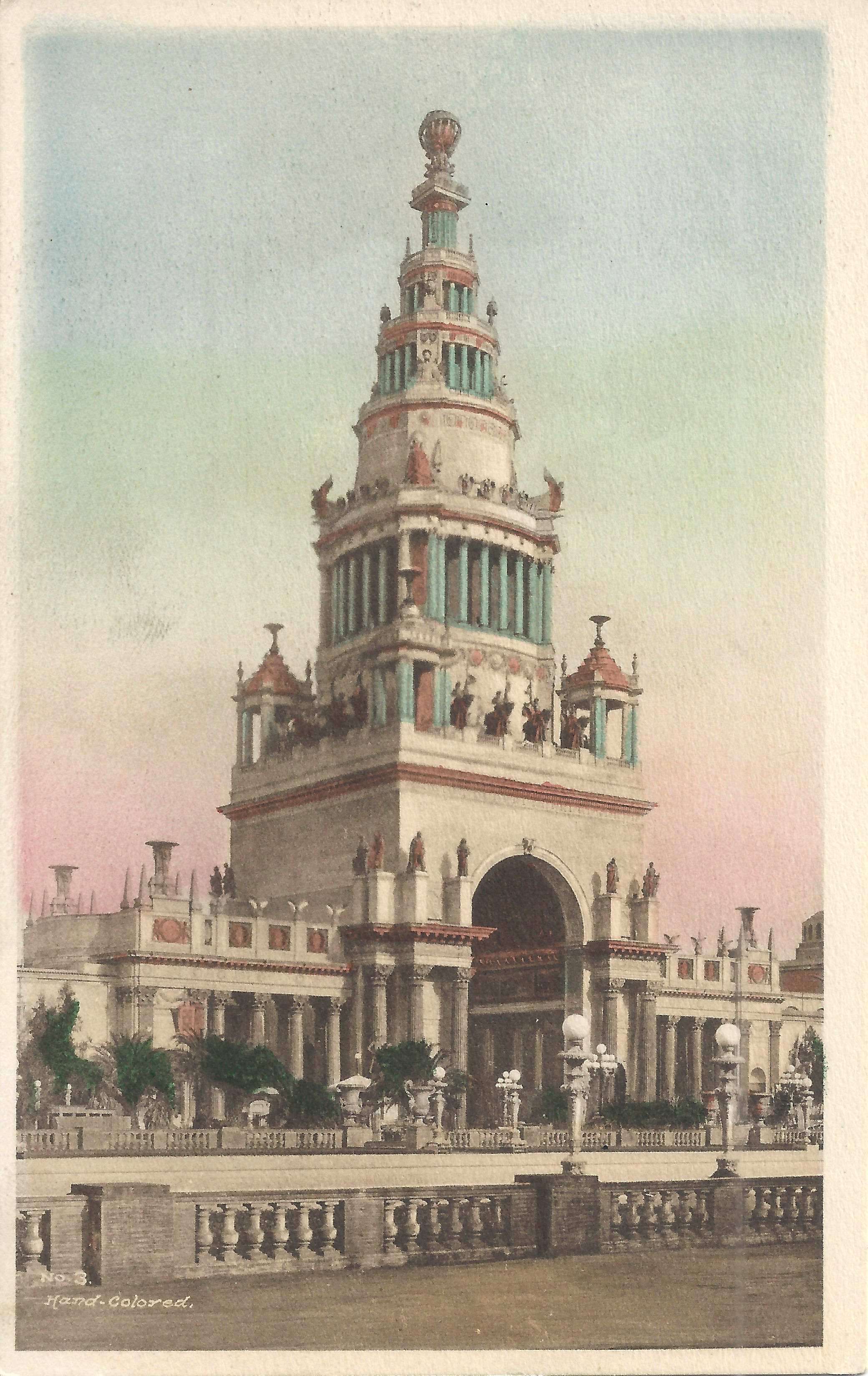
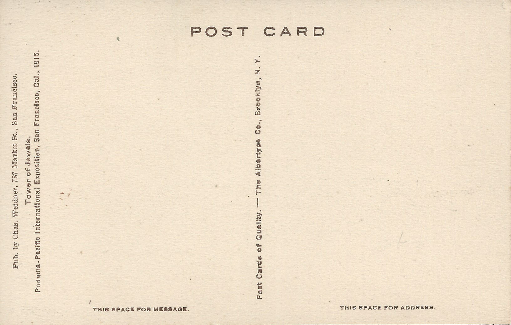
No. 3: Tower of Jewels. In addition to the difference in coloring, the image is cropped differently and the card on the right has an empty border.
 |
 |
 |
 |
 |
 |
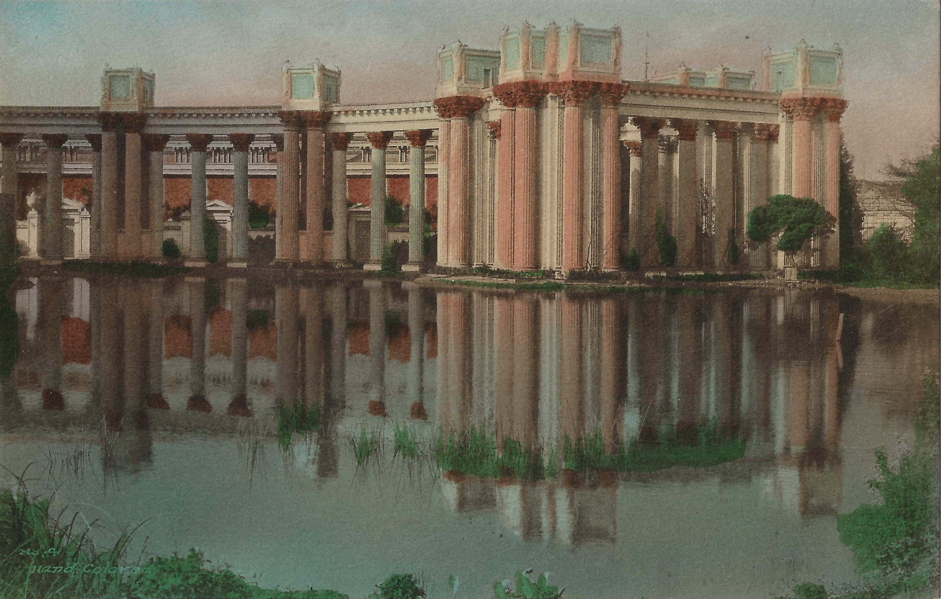
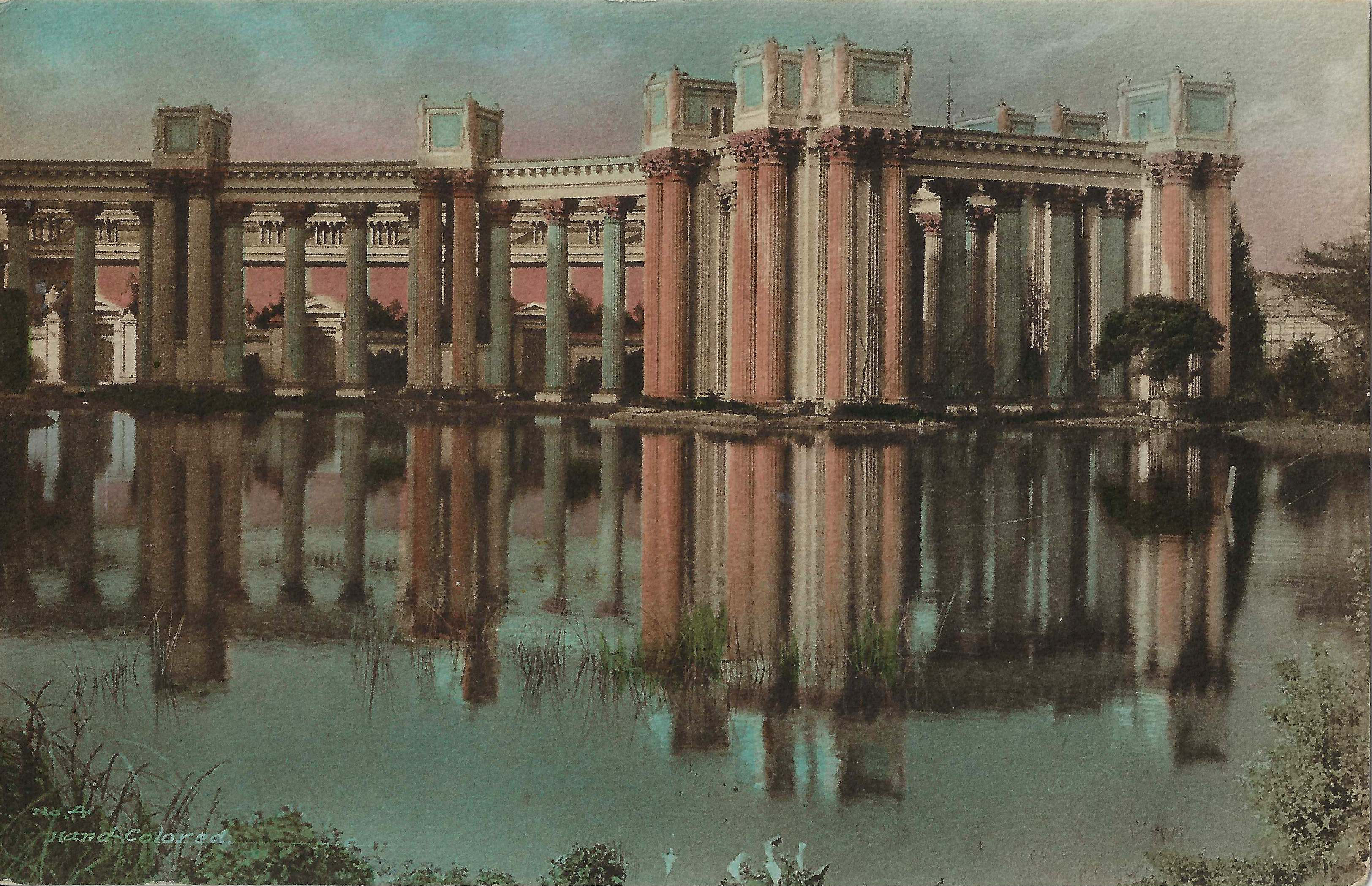
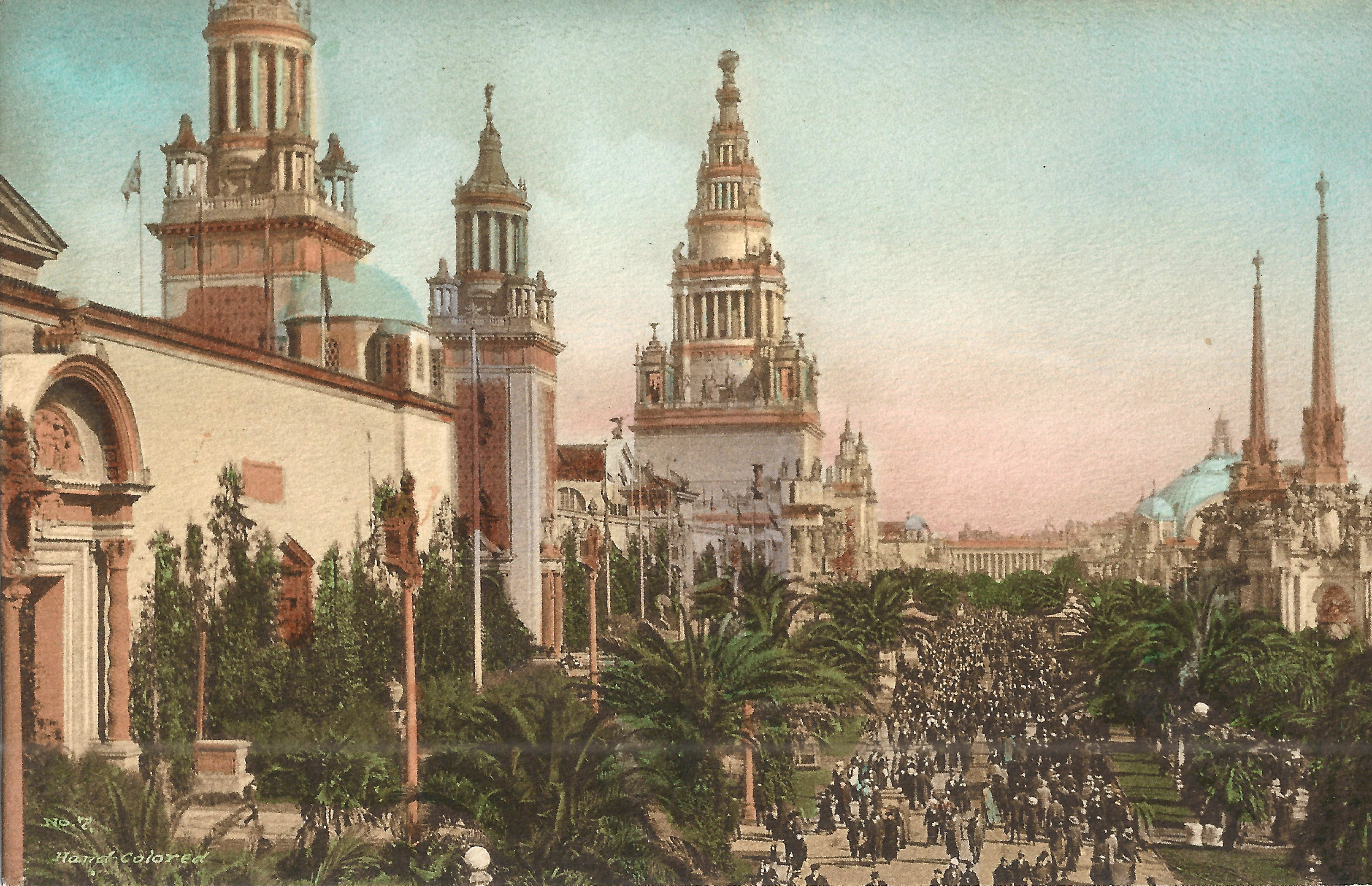
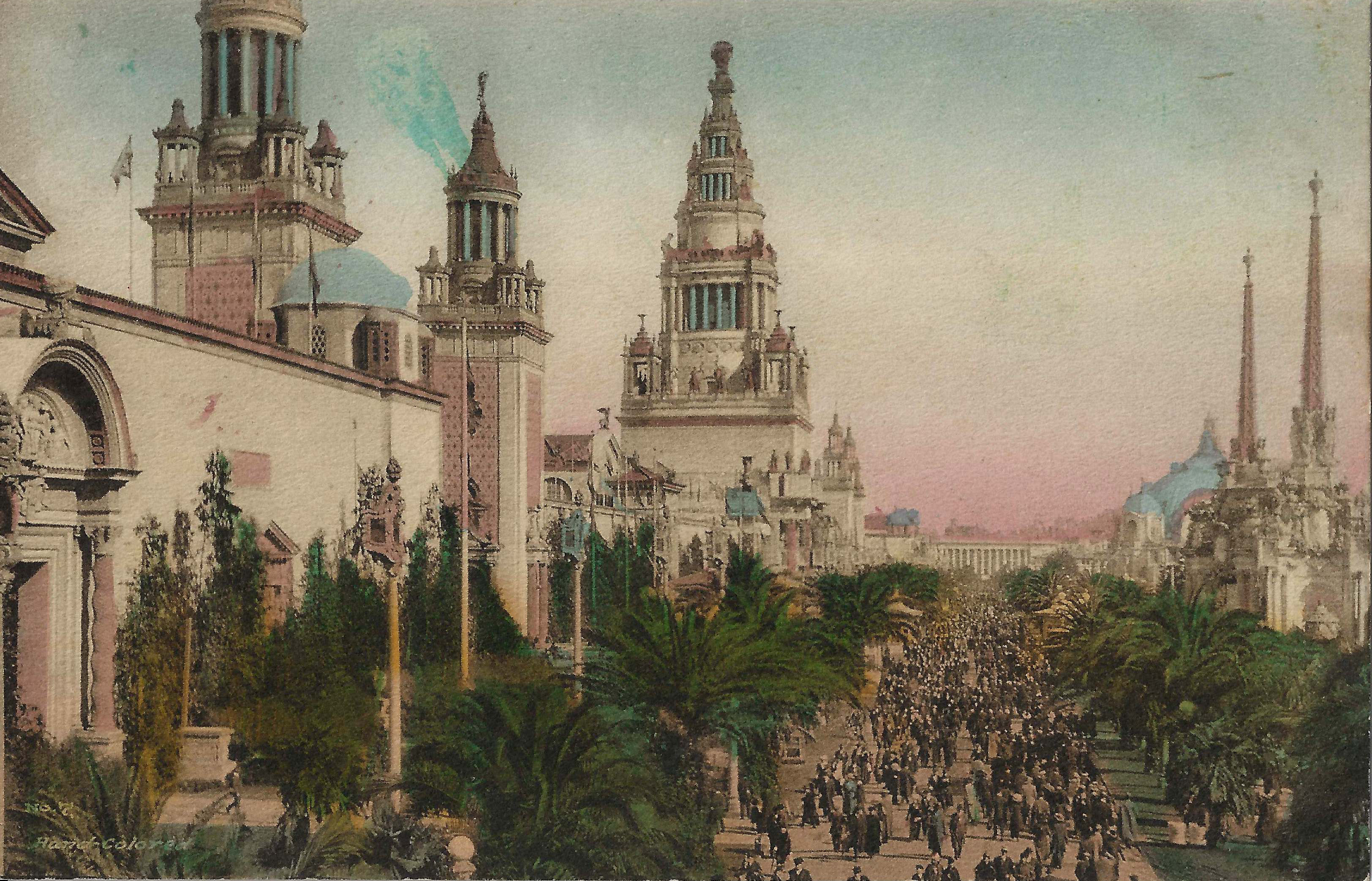
No. 4: Peristyles—Palace of Fine Arts. Each example is colored quite differently.
 |
 |
 |
 |
No. 7: Palm Avenue. The card on the right has a blue blotch next to the middle tower, presumably a coloring error. I believe the blue semicircle left of the middle tower represents a dome, but on the lefthand card the left tower is visible through it.
Steve's SF postcard pages:
AFS photos 1963-1964 Arnold Tennis
Arnold tennis 2005 Balloons

Color the Skies 2010 Fleet Week
Fleet Week 2003 Gates
Christo's Gates at Central Park Halloween

Halloween at Matt Kahn's Lodi Juggling

Lodi Juggling Festival 2003 Lowell Tennis

Lowell Girl's Tennis 2006 New Years

New Year's Eve 2003 Quilts
Independence Hall quilt show 2004